What is Statistical Data Visualization in simple terms?
- Home
- Insights
- Article
- What is Statistical Data Visualization in simple terms?
Qualitative Research Service
News & Trends
Recommended Reads
Data Collection
As the data collection methods have extreme influence over the validity of the research outcomes, it is considered as the crucial aspect of the studies
- 1. Introduction
- 2. DeepHealth’s Diagnostic Suite™: Revolutionizing Radiology Workflows
- 3. Key Features
- 4. AI Impact on National Screening Programs
- 5. SmartMammo™: Enhancing Breast Cancer Screening
- 6. DeepHealth AI Use Cases Across Specialties
- 7. Strategic Collaborations and Ecosystem Expansion
- 8. Impact and Adoption of DeepHealth’s AI Solutions
- 9. Conclusion: The Future of Radiology with AI
- 10. References
Data visualization in statistics refers to the use of graphs, charts, and maps to help understand complicated trends, patterns, and anomalies. Data visualization in statistics helps to convert complex data into visual communications that allow for the quick interpretation of trends, patterns, and anomalies, aiding in effective decision-making.[1]
How Visuals Transform Data into Meaning
- Reveal Hidden Stories: Data Visualizations can be used for aesthetic purposes, but what really catches the eye is
- Highlight Patterns: Display trends, distributions, and variability either through time or categories.
- Detect Anomalies: Enables easy detection of the possible outliers and clusters briefly.
- Simplify Statistics: Convert metrics such as average, median, and standard deviation to more intuitive forms.
Types of Statistical Visualizations
- Bar Charts & Column Charts: Used for comparing values within various categories, making it easier to see the difference and trends at a quick glance.
- Histograms: Demonstrate the representation of numerical data with focus on the distribution of the data.
- Scatter Plots: Aids in the discovery of any correlations within a set of two variables.
- Box Plots: Visualize data distribution, quartiles, and outliers to learn about data variability and characteristics of data.
- Heatmaps: Use colour gradients to represent complex values in matrices to easily identify patterns, focus, and intensity in the data.[3]
Visualization Type | Purpose | Example Use |
Scatter Plot | Shows relationships | Income level vs. education level |
Box Plot | Highlights variability | Test scores across classrooms |
Heatmap | Detects a pattern in matrices | Website click activity by hour |
Histogram | Visualizes distribution of data | Age Distribution of Customers |
Line Graph | Time trend visible | Growth of sales per month |
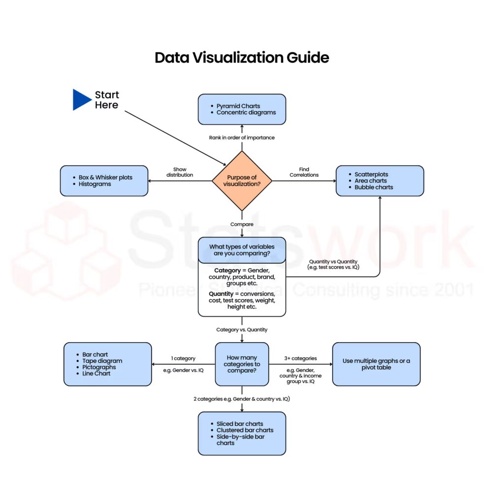
Fig. 1 shows a data visualization guide that helps select the right chart type based on the purpose of analysis and the type of variables being compared.
Visual Clarity for Better Outcomes
Visual storytelling applies data to create an easily comprehensible presentation, which can enable quicker, more focused, and more confident decision-making.
- Faster Insight Generation: Visualization makes it easier for managers and analysts to understand the insights without analyzing the data.
- Focus on What Matters: Through data visualization, teams can concentrate on important outcomes, not just focused on the data.
- Scenario Comparison: Simultaneous comparisons of images can make comparisons between various outcomes, risks, and opportunities easier.
- Strategic Clarity: Key trends and performance gaps are identified and emphasized.
- Data-Driven Direction: Although somewhat old-fashioned, visual insights help to develop evidence-based strategies to align with business objectives.
Detecting Patterns and Anomalies
- Patterns can be quickly identified for analysis through visualizing the information.
- Outliers, peaks, and troughs can serve as warning indicators of potential risk, opportunities, and improvement points.
- Correlations between two or more variables can be detected without having to perform any complicated mathematics.
- By utilizing visualizations, analysts can visually track and observe trends over time to help them create predictive models for future events.[4]
Effective Communication Through Visualization
Visual communication can act as a bridge between complex analysis and understanding by communicating data through a visual form that is more engaging and more easily understood by viewers.
- Stronger Visual Impact: A graph or chart is much more persuasive than a chart filled with lots of numbers.
- Improved Accessibility: A graphic representation will assist in relaying the message to people without advanced statistical knowledge.
- Engaging Storytelling: A graphic narrative may improve the clarity and believability of the data as well as its appeal to the message for stakeholders.
- Expert–Executive Bridge: By providing visual representations of complex statistical analysis, stakeholders can make well-informed decisions based on the information presented.
In Conclusion, Data visualization relies on statistical processes for the translation of numerical data into a form of storytelling that can be interpreted visually. Data visualization assists in the transformation of complex data into pictorial forms that can be interpreted and understandable by the user. It is used by analysts to interpret data and present results to the user for informed decision-making.
See the meaning behind the numbers—power your decisions with StatsWork’s Statistical Visualisation.
Reference
- Cook, D., Lee, E. K., & Majumder, M. (2016). Data visualization and statistical graphics in big data analysis. Annual Review of Statistics and Its Application, 3(1), 133-159. https://www.annualreviews.org/content/journals/10.1146/annurev-statistics-041715-033420
- Brezina, V., & Bottini, R. (2021). Statistics and data visualization. In The Routledge Handbook of Scientific Communication(pp. 271-289). Routledge. https://www.taylorfrancis.com/chapters/edit/10.4324/9781003043782-27/statistics-data-visualization-vaclav-brezina-raffaella-bottini
- Janetzko, H., Stoffel, F., Mittelstädt, S., & Keim, D. A. (2014). Anomaly detection for visual analytics of power consumption data. Computers & Graphics, 38, 27-37. https://www.sciencedirect.com/science/article/abs/pii/S0097849313001477