- Services
- Data Analysis services
-
Data Analysis services
-
- Meta-Analysis Research services
-
Meta-Analysis Research Services
-
- Data Collection Services
-
Data Collection Services
-
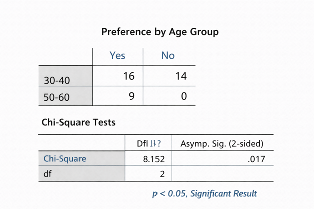
- Statistical & Biostatistics services
-
Statistical Programming & Biostatistics services
-
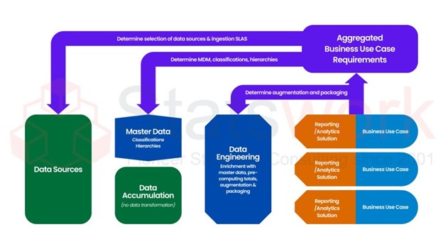
- Data Management Services
-
Data Management Services
-
- Research methodology services
-
Research methodology services
-
- Tool Development Services
-
Tool development services
-
- Statistical Interpretation services
-
Statistical Interpretation services
-
- Sample Size Calculation Services
-
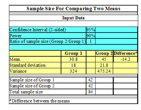
Sample Size Calculation Services
-
- AI & ML Services
-
Artificial Intelligence and Machine Learning Services
-
- Report Generation Services
-
Report generation Services
-
- Data Analysis services
- Services
- Data Analysis services
-
Data Analysis services
-
- Meta-Analysis Research services
-
Meta-Analysis Research Services
-
- Data Collection Services
-
Data Collection Services
-
- Statistical & Biostatistics services
-
Statistical Programming & Biostatistics services
-
- Data Management Services
-
Data Management Services
-
- Research methodology services
-
Research methodology services
-
- Tool Development Services
-
Tool development services
-
- Statistical Interpretation services
-
Statistical Interpretation services
-
- Sample Size Calculation Services
-
Sample Size Calculation Services
-
- AI & ML Services
-
Artificial Intelligence and Machine Learning Services
-
- Report Generation Services
-
Report generation Services
-
- Data Analysis services
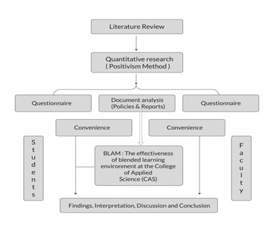
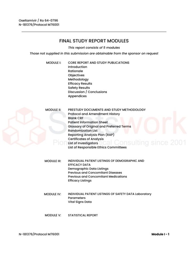
Data Collection
As the data collection methods have extreme influence over the validity of the research outcomes, it is considered as the crucial aspect of the studies