


Storyboard Creation & Narrative Visualization

Custom Data Visualization Services

Template and Graph Creation

Advanced Data Tabulation & Charting

Insightful Report Preparation
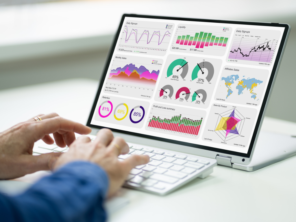
Modification of Existing Graphs

Automated Reporting & Macro-Driven Dashboards

KPI Development and Metrics Alignment.

Industry-Specific Visualizations
Professional Presentation Formats


Identify Business Context (Visual Data Usage) and Data Elements
This involves summation and cleansing of various data streams as well as aligning business imperatives and/or KPI's.
Identify Visualization Objectives, implement strategies and select the correct visual tool to use.
This would involve reviewing industry good practice to identify the relevant visual strategies, and then tools which include Power BI, Tableau or D3.js just to name a few.
Create visual frameworks using industry recognized tools
We design visuals based on creativity and/or sound analytic ability suited to end-user fluency.
Make design standardization & label consistency decisions.
We identify and ensure that clean fonts, colours and labels are used consistently and that the visual will connect to the brand.
Checks, and re-checks, and test checks.
Designers, data accuracy reviewers, peer review, validation of design intent & checking interactivity.
Deployment and support delivery of visual outputs
Finally, all visuals will be embedded or exported (with our full support to insert and for follow-up support; later versioning & new training, development and integration).

Statswork turned our raw data into actionable insights. Their visual dashboards helped us spot growth opportunities we didn’t even know existed. The clarity and impact of their visuals have improved our decision-making process tenfold.
Sophie Reynolds, Head of Strategy
- RetailCo Startup
The dashboards designed by Statswork were not only beautifully structured but also aligned perfectly with our KPIs. Their attention to detail and understanding of our business goals made the visuals incredibly intuitive.
Rajiv Menon, Senior Data Analyst
- FinSphere Technologies
What stood out about Statswork was their ability to tell a story with data. Our executive team now has real-time, easy-to-understand visuals that guide strategic planning. Truly transformative.
Linda Chang, Director of Operations
- MedAnalytics Group
We had complex data spread across systems—Statswork streamlined it into a single, interactive dashboard that our teams use daily. Their visual solutions are both functional and elegant.
Martin Lobo, CTO
- AgriTech Solutions