
- Services
- Data Analysis services
- Sample Work
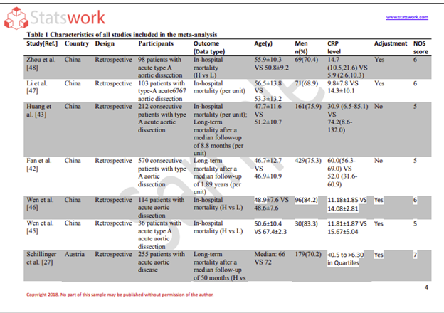
Data Analysis services
- Secondary Qualitative Research Services
- Secondary Quantitative Research Services
- Meta-Analysis Research services
- Sample Work
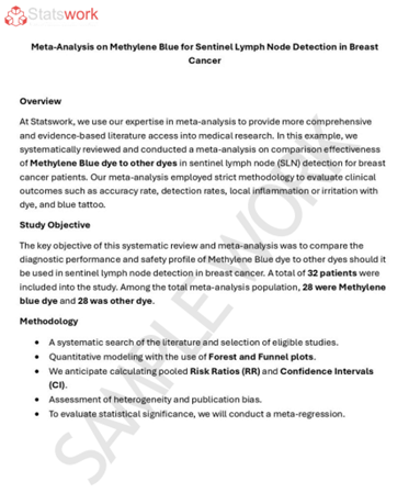
Meta-Analysis Research Services
- Data Collection Services
- Sample Work
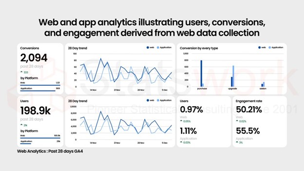
Data Collection Services
- Statistical & Biostatistics services
- Sample Work
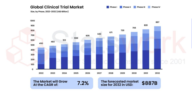
Statistical Programming & Biostatistics services
- Data Management Services
- Sample Work
Data Management Services
- Research methodology services
- Sample Work
Research methodology services
- Tool Development Services
- Sample Work
Tool development services
- Statistical Interpretation services
-
Statistical Interpretation services
- Sample Work
Statistical Interpretation services
-
- Sample Size Calculation Services
-
Sample Size Calculation Services
- Sample Work
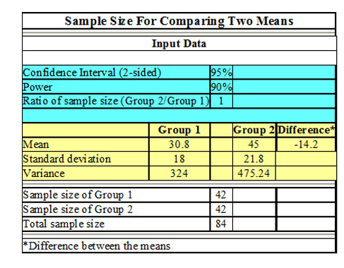
Sample Size Calculation Services
-
- AI & ML Services
-
Artificial Intelligence and Machine Learning Services
- Sample Work
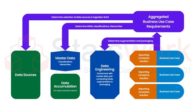
Artificial Intelligence and Machine Learning Services
-
- Meaningful Visualization Services
- Thought Leadership Services
- Report Generation Services
-
Report generation Service
- Sample Work
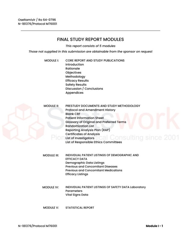
Report generation Services
-
- Data Analysis services
- Industries
- About Us
- Blog
- Insights
- Contact Us
- Services
- Data Analysis services
- Sample Work
Data Analysis services
- Secondary Qualitative Research Services
- Secondary Quantitative Research Services
- Meta-Analysis Research services
- Sample Work
Meta-Analysis Research Services
- Data Collection Services
- Sample Work
Data Collection Services
- Statistical & Biostatistics services
- Sample Work
Statistical Programming & Biostatistics services
- Data Management Services
- Sample Work
Data Management Services
- Research methodology services
- Sample Work
Research methodology services
- Tool Development Services
- Sample Work
Tool development services
- Statistical Interpretation services
-
Statistical Interpretation services
- Sample Work
Statistical Interpretation services
-
- Sample Size Calculation Services
-
Sample Size Calculation Services
- Sample Work
Sample Size Calculation Services
-
- AI & ML Services
-
Artificial Intelligence and Machine Learning Services
- Sample Work
Artificial Intelligence and Machine Learning Services
-
- Meaningful Visualization Services
- Thought Leadership Services
- Report Generation Services
-
Report generation Service
- Sample Work
Report generation Services
-
- Data Analysis services
- Industries
- About Us
- Blog
- Insights
- Contact Us
Transforming Data Tables into Business Insights with R Programming
Qualitative Research Service
News & Trends
Recommended Reads
Contact us
Summary:
R takes business raw data to convert it into information through different processes like data cleaning, data analysis, aggregation, and visualization. It helps businesses in identifying trends, groups of customers, and performance metrics from large amounts of data. With the help of different packages such as dplyr, tidyr, and ggplot2, R makes it easy to report and take decisions based on data. Interpretation of Tables Using R Software is offered by StatsWork.
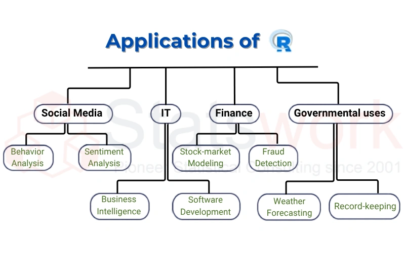
The raw data tables do not usually tell any tale of their own. The sheet full of rows of transactions, customer IDs, and time stamps is only a noise, unless someone makes sense out of it to take some action upon it. It is here that R comes into play, not only as a language of statistics but as a tool to convert raw tabular information into actionable knowledge [1].
Since R was created around the data frame that is basically a table structure, operations such as row filtration, grouping by categories, and numeric aggregation come naturally.
Combined with packages like dplyr, tidyr, and ggplot2, R lets you go from a plain table of numbers to a chart that answers a real question in just a handful of steps.
Why Businesses Rely on R for Table Analysis
Before discussing the process itself, it is important to understand why R is such a convenient choice for converting tables to meaningful business insights:
Effective processing of big tables with many rows
- Internal statistical capabilities – trends, correlations, forecasts come effortlessly rather than as an addition
- Reproducibility – you do not need to repeat all your efforts again with the next month’s tables
- Powerful visualization capabilities – with ggplot2, you will convert your tables into meaningful charts [2]
- Free and open source – no license costs to limit you in scaling up the analysis
Starting With the Raw Table
The journey usually begins with loading and inspecting the data. Suppose a retail company has a table of sales transactions like this:
| Order ID | Customer ID | Region | Product Category | Order Date | Quantity | Unit Price |
| 1001 | C204 | West | Electronics | 2026-01-05 | 2 | $149.99 |
| 1002 | C118 | East | Apparel | 2026-01-05 | 1 | $39.50 |
| 1003 | C204 | West | Electronics | 2026-01-07 | 1 | $89.00 |
| 1004 | C332 | South | Home Goods | 2026-01-08 | 3 | $22.75 |
Before drawing any insight, you need to understand what you’re working with — are there missing values, duplicate orders, or inconsistent formatting? This initial inspection saves a lot of headaches later, since decisions built on flawed data are often worse than no decisions at all.
Cleaning Before Analyzing
Business data is rarely tidy. A typical cleaning pass addresses a few recurring issues:
- Text dates will be changed to formatted dates
- The capitalization of category names will be made consistent [3]
- The revenue will be calculated as a product of quantity and unit price
- Records without information about customers and those containing incorrect data on revenues will be filtered out
For example, order 1001 above, once cleaned, would show a calculated revenue of $299.98 (2 units × $149.99). That single revenue figure is often the first real business metric derived from a raw table — the moment where plain data becomes money.
Aggregating Into Meaningful Metrics
This is where real value emerges. A single sales table can answer very different business questions depending on how it’s grouped and summarized.
Example — Revenue by Region
| Region | Total Revenue | Orders | Avg Order Value |
| West | $482,310 | 1,204 | $400.60 |
| East | $398,120 | 1,050 | $379.20 |
| South | $210,455 | 640 | $328.80 |
That single summary tells a manager where sales are concentrated (West) and where average basket size is lagging (South) two different business questions answered from one table [4].
Example — Customer Segmentation
The same underlying data, grouped differently, can classify customers by value and activity:
| Segment | Description |
| High Value – Active | Spent over $1,000, purchased within the last 30 days |
| High Value – At Risk | Spent over $1,000, no purchase in 30+ days |
| Standard | Spend below $1,000 regardless of recency |
What started as a flat sales table becomes a segmentation model that marketing teams can act on directly for retention campaigns.
Reshaping for Reporting
Stakeholders often want a pivoted, summary-style table rather than raw transactions. Reshaping the same data by region and product category produces a cross-tab like this:
| Region | Electronics | Apparel |
| West | $310,200 | $98,400 |
| East | $210,500 | $130,900 |
| South | $95,300 | $60,150 |
This is exactly the format that gets pasted into an executive summary or board presentation — compact, comparable, and immediately readable.
Turning Numbers into Visual Insight
A table of figures is accurate but difficult to understand. Visuals make the same figures jump out from the paper:
- A graph showing monthly revenue becomes very clear whether there is a growth pattern or seasonal decline
- A graph comparing revenue between different regions is easier to understand than looking at figures
- A stacked graph of revenue by product category in each region
When you have people who are interested in the bottom line, a good graph can save you a whole page of tables [3].
The End-to-End Process
Put together, a typical business analytics task in R follows a consistent process:
Raw table extraction from the source file (CSV, Excel, or database)
- Table’s structure analysis with respect to any possible mistakes in the form of blanks, duplicates, and wrong data type
- Data cleansing with the help of such procedures as formatting, categorization, and invalid record deletion
- Conversion of raw data into metrics (such as revenue, churn rate, or growth)
- Aggregation procedure including grouping and summarizing for the solution of business problem
- The reshaping procedure of aggregated table into new formats
- Data visualization in the form of pattern displayed in chart format
- The communication procedure of insight with report, dashboard, or presentation
Each stage moves the data further from being just a raw table and closer to being an answer to a business question.
Key Takeaway
R doesn’t just process tables — it lets you interrogate them. Every grouping operation, every pivot, every chart is really a business question expressed in code: which region is underperforming, which customers are at risk of leaving, is revenue trending up or down. Mastering these table transformations means spending less time staring at spreadsheets and more time acting on what they reveal.
Conclusion
Converting the raw tables of data into decisions that will take a business forward is not just about being skilled in using R; it requires a process that involves thorough analysis and the insight to know what measure goes with what question [4]. Companies who need this process to be done reliably and consistently at scale turn to Statswork for an interpretation of tables service using R programming skills and understanding of business.
Frequently asked question:
R programming is used for statistical analysis, data visualization, data mining, machine learning, and business intelligence to help organizations make data-driven decisions.
Neither language is universally better; R is ideal for statistical analysis and data visualization, while Python is better for general-purpose programming, automation, and machine learning.
No, R is a high-level programming language designed for data analysis and statistics, whereas C++ is a general-purpose programming language focused on system and application development.
Yes, R is relatively easy to learn for beginners, especially for those interested in data analysis, statistics, and research, as it provides many built-in functions and packages.
You can learn the basic concepts of R in two days, but becoming proficient in data analysis and advanced programming requires regular practice and hands-on experience.
R is better than Excel for handling large datasets, advanced statistical analysis, automation, and reproducible research, while Excel is more suitable for simple calculations and basic data management.
Reference
- Grover, P., Kar, A.K. Big Data Analytics: A Review on Theoretical Contributions and Tools Used in Literature. Glob J Flex Syst Manag18, 203–229 (2017). https://link.springer.com/article/10.10
- Nitin Liladhar Rane, Mallikarjuna Paramesha, Saurabh P. Choudhary, & Jayesh Rane. (2024). Artificial Intelligence, Machine Learning, and Deep Learning for Advanced Business Strategies: A Review. Partners Universal International Innovation Journal, 2(3), 147–171. https://doi.org/10.5281/zenodo.12208298 https://puiij.com/index.php/research
- Nuur, J. M., Bagiro, A., Vayyala, R., Oyebode, D., Alasmrai, M. A., Alhebri, A., … & Elmouki, I. (2026). Transforming the Future of Finance and Business Management with AI: Exploring Mathematical Modeling, Automation, Risk Management, and Data-Driven Decision Making. Scientific African, e03438. https://www.sciencedirect.com/science
- Badshah, A., Daud, A., Alharbey, R., Banjar, A., Bukhari, A., & Alshemaimri, B. (2024). Big data applications: overview, challenges and future. Artificial Intelligence Review, 57(11), 1. https://openurl.ebsco.com/EPDB%3Agc